


Lupine Publishers Group
Lupine Publishers
ISSN: 2641-1725
Review Article(ISSN: 2641-1725) 
A Novel Model to Predict The Epidemics Trends And Its Application in Covid-19 Volume 5 - Issue 4
Received: October 07, 2020; Published: October 22, 2020
*Corresponding author: Shu-Qing Yang1School of Civil, Mining and Environmental Engineering, University of Wollongong NSW 2522, Australia
DOI: 10.32474/LOJMS.2020.05.000217
Abstract
For every epidemic, the public and decision-makers worry that the number of infected people will be far more than the healthcare system can afford, thus it is important to predict the cases which need medical services. This is similar to cases of natural disasters such as floods when a devastating outcome occurs with incoming and outgoing water volume being higher than a river’s storage capacity. The similarities between floods and epidemics inspire a modified rainfall-runoff model, I&α. This novel model focuses on the prediction of active cases, i.e., y0, which measures the number of people who need medical services. This model is based on the past data for the prediction of future epidemic trends. This model can effectively predict the maximum y0 and its peak date when applied to model COVID-19, with an average error of 3.8% and 2.7 days, respectively. The average error for y0 on May 12, 2020 is 22.7%.
Introduction
Mathematical models can predict what will happen to allow
for response planning. As an example, this can be seen in daily
weather forecasting to predict natural disasters such as typhoons,
hurricanes, earthquakes, floods and epidemics. In modern life,
an effective mathematic model can help save many lives and
resources, especially as it applies to decision-makers making more
effective choices when faced with many high uncertainties. As an
example, some natural phenomena are able to be deterministically
predicted such as sunrise, sunset and tidal variation, but most
of are quite uncertain such as population growth, stock market,
floods and COVID-19. In the literature, many models are available
for a variety of purposes, but few have been extended beyond the
specific scope. One example is the rainfall-runoff model which has
been successfully used to predict floods. It is understood to have
not yet been applied to model other disasters such as the COVID-19
pandemic. This paper makes an attempt to extend this application
to COVID-19.
There are many similarities between floods and epidemic
events. Firstly, both have a devastating impact on people’s lives
and the economy if not well prepared and managed in a relatively
short time; secondly, both have high uncertainty in regards to data
collection, analysis and prediction. For COVID-19, tremendous
effort has been expended in collecting the data and modelling key
parameters such as the number of deaths, infected cases, the peak
number and dates etc., yet it is understood at this stage that no
model can accurately predict these parameters due to the complex,
dynamic and heterogenous realities of the pandemic in different
countries. Similarly, this same problem also exists in modelling the
rainfall-runoff process. Therefore, the successful experience in the
rainfall-runoff models may be helpful to develop a modified model
for prediction of epidemics trends, such as the COVID-19 epidemic.
Problems in the existing curves for modelling
For any model, the first step is to choose a key parameter for prediction. To educate the public how the protective measures work, Figure 1a below has been widely used by the mainstream media and governments including Germany in which the important parameter is blearily labelled as “# of cases”: The humped curve in Figure 1a is similar to the hydrograph shown in Figure 1b in water engineering, where a pair curves with different peaks have been also been used by water engineers to explain how the ‘sponge city’ works, i.e., the porous surface, rather than impermeable pavement can effectively reduce the peak discharge, thus the city’s economic loss by water logging can be reduced when the peak discharge matches its drainage system capacity. Unfortunately, Figure 1a may mislead the public, because: The definition of “# of cases” is not clear. It could be daily new cases, daily deaths, daily recovered numbers; or its definition differs from individual opinions. These definitions do not directly connect with “Healthcare system capacity”. However, the active cases with the following definition can connect with the “Health care system capacity”:
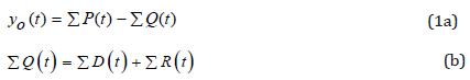
where t = time, y0 = active number, P = number of daily infected patients, Q = number of daily removed number, D = daily dead number, R = daily recovered number and Ʃ is the summation sign. Obviously, a disease will not become epidemic if y0 = 0 in cases like Σ P = Σ D and Σ P = Σ R , representing that all infected cases are dead (e.g., a group of people are killed by highly toxic substances), or all infected people can be recovered without death e.g. a ‘common cold’. Similar to a river flow, floodwater levels jointly depend on the incoming flow (similar to ‘P’ in the hospital), evaporation/ infiltration loss (similar to ‘D’) and the outgoing flow (similar to ‘R’). Overflow or disaster will happen when the maximum y0 is greater than the river’s storage capacity. The same may be true for a hospital, if the maximum y0 is less than the number of hospital beds, it is safe for the healthcare system, otherwise disasters have the potential to occur. Therefore, it is recommended that the ‘# of cases’ is defined as y0, or the active cases. As per the example, it is understandable that (ⅆy_0)/ⅆt>0 means the river water level will rise, and (ⅆy_0)/ⅆt< 0 means that the river water level is going to fall. For a healthcare system, protective measures should be taken to flatten y0 to the acceptable level, and the maximum y0 appears when
(d y _ 0) / dt = 0 (2)
Eq. (2) implies that the climax appears when the daily inflow to
hospitals is equal to the daily outflow, i.e.,
P(t)=Q(t) (3In practice, the y0 curve can be divided into three
stages, the rising limb, wavy stage at the peak and the falling limb. The
climax point or the turning point can be confirmed when: i) Eq. 2 or
Eq. 3 is satisfied; ii) this y0 is the highest in subsequent days, e.g. half
of the incubation period, for COVID-19, when 7 days are expected. In COVID-19, the author has closely monitored the y0 versus time
from Feb. 7, and found that China’s maximum y0 is 58097 occurred
at 8:00am, on Feb. 18, 2020. At that time, the Chinese government
only reported the total infected cases, suspicious cases, deaths and
recovered cases, respectively without y0, thus it is not possible
to infer the climax point from these curves. For example, Chinese
President Jinping Xi claimed on Feb. 21 that the turning point could
occur in the near future On Feb. 27, [1] predicted that “the epidemic
in China should peak by late February, showing gradual decline by
end of April”. The author’s daily y0 chart has attracted the Chinese
government information which has added y0 (number) to its
website from Feb. 27. From March 11, the Chinese Government
also published the y0 chart on its website. Consequently, the author
has shifted attention to predict other countries’ epidemics using
the same methodology and the results have been published in his
social media including Facebook, LinkedIn, tweets and the website:Currently, many websites published the
daily number of y0, but until May 12, some governments have not
supplied the number of y0 on their website. This included: the UK,
Norway and the Netherlands as the recovered number ƩR had yet
to be made public. Figure 1a shows that the protective measures
will extend the period of this pandemic event. However, there
is some room for man oeuvre, because protective measures can
contain all infected people in a specific area without out-spreading,
thus it could shorten the epidemic period. As mentioned above,
water engineers often use the two curves in Fig. 1b to judge their
design of a “sponge city”, in which the mass conservation principle
is used, i.e., the total water volume will be the same with/without
“protective measures” because water is tentatively stored in the
sponge or soil, therefore longer time is needed for a sponge city. In
Figure 1a and 1b, the areas under two curves are almost the same,
which means that for an epidemic event like COVID-19, the number
of total infected people would remain unchanged with or without
protected measures. Obviously, for a pandemic, this assumption
in Figure 1a is not true. This can be seen from the reported cases
in Hong Kong, Taiwan and New Zealand when compared with
Singapore, where their confirmed cases on May 9, 2020 were 1045,
440, 1492 and 22,460, respectively, noting that Singapore has the
least population. The initial conditions shown in Figure 1a differ
from each other in scenarios with/without protective measures.
In reality, at t = 0 when an epidemic is just discernible, the case
numbers and the gradient must be the same for both scenarios.
Even when the protective measures are applied at t = 0, the curve
would be flattened some days later due to a delay effect, thus the
two curves in Figure1a should overlap in the beginning. Therefore,
Figure 1a is questionable in the view of water engineering because:
its definition of y-axis is not clear; it implies that if the curve is
flattened by protective measures, the pandemic will last longer;
even for the curve with a lower peak number, the total number
of infected cases remain almost unchanged; the initial slopes for
scenarios with/without protective measures should be the same.
Figure 1(a): widely used curves in COVID-19 for the effect of protective measures, and the hydrographs for “sponge city” design in Figure. 1b.

The above arguments support [2] comment, in which they claimed that Figure 1a is unfortunately misleading.
Rainfall-runoff model for flood prediction
In the science of water engineering, it is very difficult to model a hydrograph accurately due to many interrelated factors such as: uneven distribution of rainfall over a catchment, insufficient accurate measurement of rainfall and river flow, and unknown losses caused by infiltration/evaporation. However, decisionmakers need to know quickly the peak flow and peak time for a quick response. To meet this demand, many rainfall-runoff models have been successfully developed. Among them, the unit-hydrograph [3- 5] has been widely used due to its simplicity. This model assumes that, for a catchment, its future flood events can be inferred from its past flood events, and the future peak discharge can be predicted by scaling its past peak discharge, and the scale number can be determined using the rainfall information. By definition, a hydrograph is a graph showing the rate of flow (discharge) versus time past a specific site in a river course. A unit hydrograph is the hydrograph resulting from a unit (e.g. 1mm) depth of rainfall during a particular time period (e.g. 1 hour) over the catchment. Once the unit hydrograph was observed, as shown in the middle level of Figure 2, the future flood for different rainfall patterns can be predicted by scaling the unit hydrograph. This method converts rainfall to a flood hydrograph by applying a transfer function, i.e., past hydrograph. The basic principle of the rainfall-runoff model is that there is a linear relationship between the rainfall and hydrograph, hence, the superposition shown in Figure 2 is feasible. As unit hydrographs form a linear system, the ordinates of the direct hydrograph are linearly proportional to the depth of rainfall. For example, if the rainfall is doubled, the maximum discharge will be doubled, and will also double the discharge at other hours in the hydrograph. The unit hydrograph comes from past measurement. To predict future floods, one only needs to input the measured rainfall in a sequence, one after another, such as: I1, I2, and I3 in Figure 2. The resulting direct hydrograph is equal to the sum of the runoff from each individual period of rain. Using this method, water engineers can quickly estimate the possible peak flood and its peak time. Generally, its accuracy is sufficiently acceptable for decisionmakers to response. Figure1a and Figure 2 describe different phenomena, and mathematically there are some similarities as the epidemic event can also be divided into different phases such as: I1, I2 and I3 in Figure 2. If very careful measures are applied in the earliest stage, one should only observe the lowest curve in Figure 2; otherwise higher peak number and delayed peak time are expected. Therefore, inspired from Figure 2, one may improve Figure1a with the following features:
a. In the rising limb, different curves should share the same
pattern initially, and a discernible deviation of curves happens
after a certain period. If so, one may infer that “rain continues”
or the virus has continued spreading without being fully
contained. Alternatively the 1st phase count-measures are not
effective;
b. If protective measures are applied earlier, the ending time
must be earlier as shown in Figure 2 because the “rain ends
earlier”;
c. If the protective measures are very effective, the number
of infected people may be reduced; this means that the peak
number and affected time become smaller.
1. Based on the above similarities between (Figure 1a-3 ) is generated to improve Figure 1. Development of I&α model and its application in COVID-19 For the prediction of epidemic like COVID-19, it is difficult to apply the rainfall-runoff model directly, because:
a. There is no similar parameter as rainfall I;
b. There is no similar curve as the unit hydrograph.
It is noted from Figure 2 that the rainfall I1 is actually a scale number between the observed curve in the lower layer of Figure 2with a standard curve which was called as “unit-hydrograph” by water engineers. In other words, I1 can be obtained by comparing the measured data with the unit-hydrograph curve at time of “1” in Figure 2, or I1 can be determined using the “initial” condition. Once this proportionality I1 is determined, the whole curve including the climax point can be determined, or the epidemic trend can be predicted. For Figure 3, it is assumed that all countries’ curves follow the same pattern if all take cautious measures in the earliest stage, the only difference is the scale number: I1. If no effective count-measures are taken in the I1 stage, from Figure 3 the realtime data will deviate the cautious curve somewhere in the rising limb. Likewise, as shown in Figure 2, if the ‘rain ends’ in I2 stage, then the turning point or climax point can be delayed, its magnitude can be determined jointly by rainfall I1 and I2. At time of “2” in Figure 2, the unit-hydrograph method gives the discharge of I1u2 +I2u1. Obviously, this linear summation cannot be used in Figure 3 to determine the yellow curve as there are unknowns such as I1, I2 and unit-hydrograph. Alternatively, it is suggested that another standard curve be selected to represent those countries whose data cannot be expressed by the cautious curve. It is assumed that those countries’ curves follow the same pattern and the difference in y0 can be scaled by a constant I. Therefore, the (careless) curve in Figure 3 is also generated.
Figure 2:Unit-hydrograph method to predict hydrograph by storms, where the ordinate of hydrograph is scaled by the rainfall I and discharge q is superposed, and the starting time is shifted by matching the beginning of rain.

Figure 3: A conceptual graph of active cases y0 based on the same cause-effect relationship shown in Figure 2.

The outbreak of COVID-19 started in December 2019 in Wuhan, China, and a local seafood market was suspected as the virus source [6]. On Jan. 20, 2020, the Chinese government officially took protective measures to contain it. On Jan. 23, due to its explosive growth of the infected population, the local government of Wuhan suspended all public traffic within the city, and closed all inbound and outbound transportation. [6] estimated that on Jan. 25, 2020, there were 75, with 815 individuals infected in Wuhan. Hence, one can infer that the y0 curve from Wuhan can be represented as a city which not did take action in the 1st stage, its curve can be used as a “unit-hydrograph” or standard curve to scale other countries or cities who have similarly missed the opportunity to take protective measures in the earliest stage. On Jan. 20, 2020, other provinces and cities in China took immediately protective measures against the virus outspread. [6] estimated that on Jan. 25, Chongqing, Beijing, Shanghai, Guangzhou, and Shenzhen, had imported 461, 113, 98, 111, and 80 infections from Wuhan, respectively. Therefore, the y0 curve from the rest of mainland China without Wuhan can be used as a benchmark for other cautious places in the world. To avoid the bias caused by the small size, all y0 from China without Hubei forms the “unit-hydrograph”, and the scaled number one can be obtained by matching other countries’ y0 with the benchmark.
As an alumnus of Wuhan University, the author was requested
to model the hospital beds needed to prepare on Feb. 5, 2020 when
the confirmed cases were 28k and suspicious cases were 25k.
Based on the information, the author replied that the required
number of hospital beds could be y0 = 35k with a safety factor of
1.5-2 (i.e., 52.5k-70k bed) for the whole China, and 2/3 of them
would come from Wuhan (35k-47k beds). On Feb. 14, the Wuhan
government prepared to build 100k new hospital beds by April
20. The author criticized this over-action based on his estimation
and finally 40k beds were constructed in Wuhan. For China, the
maximum number of beds used in its hospitals was 58.1k, very
close to the initial estimation (52.5k-70k). The author started to
predict the active cases for other countries from March 14, 2020.
He found that the cautious model met Thailand’s data with a scale
number of 0.16 as shown in Figure 4a. For all figures in this paper,
the starting date is Feb. 15, 2020 except for the figure for the world,
in which the starting date is Jan. 20, 2020. South Korea’s data fits
the careless model well until the middle falling limb, after that,
Korea’s data points follow a straight line, obviously deviate from the
expected curve. This is probably caused by the strategies without
lockdown, which differs from Wuhan. For Australia, the data
points before March 21, fit the cautious model well when the scale
number I =0.12 was used, but the data points start to deviate from the cautious model from March 21. It was found that the careless
model fits the data points well when I = 0.1 was used. Figure 4
shows that these models can well predict the rising limb, climax y0
and peak date, but noticeable discrepancies exist in the falling limb,
during which different countries reopened their economy causing
the discrepancy. Some sharp drops in the falling limb indicate that
the data quality keeps improving.
As shown in Figure 4, the linear scale model works reasonably
well once the scale number is determined, using the initial condition.
These figures demonstrate that the benchmark curve observed in
the past is similar to the future curve for some countries. Once the
proportionality ‘I’ is determined using the “initial” condition, the
whole curve is determined including its climax time. However, this
approach does not fit countries where the virus has been widely
spread when protective measures were taken, or the protective
measures were not as effective as Wuhan. Generally, these countries
take a longer time to reach its climax point than these models’
prediction. In order to model this delay, a relaxation coefficient α is
introduced with the following definition:
T = T0(1+α) (4)
where T0 = time used by the benchmark curve, T = time used for another country to predict. Obviously, if α = 0, T = T0 as shown in Figure 4. But if α > 0, then the country/city needs to take longer time to end the epidemics than Wuhan, also it takes longer time to its climax point than Wuhan. For example, Wuhan had 500 confirmed cases on Jan. 23, and the climax point appeared on Feb. 18, so T0 = 26 days. Italy had 500 confirmed cases on Feb. 27, and its peak date occurred on April 22 with maximum y0 = 110,432, so T = 55 days, Eq. 4 gives α = 1.11. The author obtained α = 1.3 and I = 11.5 for Italy by matching the available data in March and the agreement is included in Figure 5. Generally, the parameter “I” can control the number of maximum y0 and α can control the peak time. Both can be obtained from the initial conditions by matching the benchmark curve with the available data. One can predict the future y0 curve once both parameters are determined, and Figure 5 shows the comparison of predicted and reported active cases from selected countries. Figure 4shows that USA and Russia are still on the rising limb. Canada and Italy are at the top wavy stage, and German and Switzerland are in the falling limb. Table 1 shows that the comparison of predicted and reported peak y0 and peak date. It can be seen that, similar to the prediction of peak floods, the model results are reasonably good for decision-makers to prepare the required medical resources.
Figure 4: one parameter (I) model is used to predict active cases in Thailand, South Korea and Australia where the vertical thick lines are the first date in every month.

Figure 5: Comparison of two-parameter model with the reported active cases till May 12, 2020.

Prediction of numbers of total deaths and recovered
In Table 1, countries like UK, Netherlands, Sweden, Mexico and Norway do not report their recovered number ƩR or their reported ƩR is obviously not accurate. It is also observed that many countries’ y0 value falls sharply over night, this could be caused by changing the recovered standard or rectifying the recovered data. Nevertheless, a simple and easy model for the removed number ƩQ is needed for different purposes. Generally, all infected patients ƩP will be removed from the list sooner or later after a certain period as being either recovered or dead. Individually, the time from a confirmed case to the removed case varies largely from a few days to weeks, but on average, the time should be a constant. By analysing the data from Germany, Switzerland and India, it is found that the average time is 14 days, which is slightly different from [7], who, based on 47 patients, found that the median hospital stay was 10 days. But [8] found that in China the median number of days from the confirmation to be removed was 14.0 by examining 1975 cases. By using a large patient number from these countries, it can be seen that 14 days delay is acceptable as shown in Figure 6. Mathematically the relationship can be approximated as:
ΣQ(t) = Σ P(t − 14) (5)
In Figure 6, the data points are the accumulative removed number, and the curves are the accumulative confirmed cases of 14 days previously. It can be seen that the agreement is reasonably accurate, thus Eq. 5 can be used to estimate the removed number for those countries which did not report their recovered number as listed in Table 1. For these countries, on May 12, the number of total removed cases is equal to the number of total confirmed cases on April 29, with a delay of 14 days. For example, German had 7760 total deaths (i.e., ƩD) on May 12, and total recovered cases of 151,789 (i.e., ƩR), therefore the total removed cases ƩQ = 159,549. On April 29, Germany had a total of confirmed cases of 160,599, with the relative error is 0.7%. Likewise, UK had total confirmed cases of 162,350 on April 29; this number is assumed to be the removed number for UK on May 12, i.e., ƩQ = 162,350. The UK government reported total deaths was (ƩD) 32,692 on May 12, thus one can infer that the number of total recovered cases in the UK on May 12 was ƩR = ƩQ - ƩD = 129,658. Similarly, the recovered number for other countries can be modelled using the same method. A more accurate model for the removed number Q can be developed using the same methodology of “unit-hydrograph” as shown in Figure 2, if a probability density function of the removal process is given, as shown in Figure 7 from day 1 to day N, and the corresponding probability is p1, p2…pN, which was assumed in Figure 7, i.e., the percentage of removed people in each day after infection. Obviously,
 (6)
(6)Figure 6:The relationship between the total removed number ƩQ and the accumulative number of confirmed cases ƩP with a delay of 14 days.

Figure 7:Probability distribution for a confirmed case to be removed.

Table 1: Comparison of predicted and reported maximum y0 and the peak date.

On day j, the number of new confirmed cases is P(j). These patients will be removed from the day j+1 till the day j+N, and every day the number of removed cases is P(j)p1, P(j)p2,….P(j)pN. Similar to Figure 2, the probability curve is multiplied by P(j) each day and the sum of the removed number can be equal to the number of daily new cases, i.e., P(j):
 (7)
(7)Therefore, a super-position can be applied with the probability distribution in Figure 7, the daily new cases on day j will produce the jth curve, in which the ordinates are factored in proportion to P(j). Similar to Figure 2, the number of removed cases for each day is then the sum of all curves’ ordinates. Mathematically, the number of removed cases each day can be calculated using the following equations:
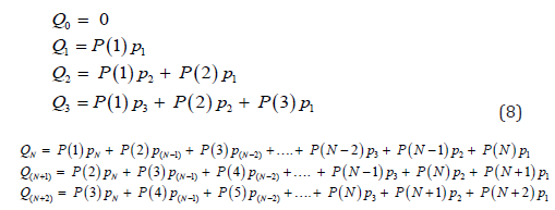 (8)
(8)The first column of equation from Q1 to QN on the right hand side represents the removed number from P(1) at the beginning of the epidemics, while the second and third columns represent the removed number in the subsequent days for those who were confirmed in day 2 and day 3 of the epidemic. The daily removed number is delayed by one day from N to N+1, which is the time step, because the daily new cases P(1), P(2) and P(3) occur in successive days. Thus, the summation of ordinates is feasible, and can be expressed as:
 (9)
(9)Unfortunately, in COVID-19 pandemic, no government has disclosed the required “unit-hydrograph” shown in Figure 7, thus this model cannot be used to simulate the recovered cases for such countries as the UK. It is expected that in future, every government will report their daily y0 as well as the removed information as shown in Figure 7. In order to predict the three most important parameters, namely the total confirmed cases, total deaths and total recovered, our starting point is the prediction of y0 as shown in Table 1. As shown in Eq. 1a, future new cases ƩP can be predicted using y0 and ƩQ, i.e.,
ΣP = y0 + ΣQ (10)
The number of total deaths, ƩD, is generally a portion of the infected number ƩP, thus the total deaths can be also modelled. Finally, the total number of recovered cases ƩR can be modelled from ƩQ – ƩD. Therefore, using the initial condition, one can determine y0, subsequently other parameters can be determined. In the whole process, the initial condition is important, and normally it should be updated using the new available data. For example, in Figure 3, the cautious model uses the data at t = 0 for its initial condition, but the careless model should use the data deviated from the cautious model as its initial condition. Likewise, when the data deviates from the careless model, the new data can be used as initial condition for the I&α model.
Discussion and conclusion
This paper developed a simple I&α model to predict the
active cases y0 in a pandemic by extending the “unit-hydrograph”
methodology used in water engineering. The model is based on the
assumption that the past data can be used for the future; the past
y0 curve in one country is similar to the future curve for another
country; the difference between the curves can be adjusted using
the factor I and α, the former controls the y0 value; and the latter
expresses the delay effect. Differently from existing models which
generally need sophisticated software and sensible parameters
to feed, this model simply needs to match most recent data as its
initial condition, and subsequently the calibrated model can be
used for prediction.
The I&α model has been applied to predict approximately
50 countries’ maximum active cases, and their peak time in the
COVID-19 period. The results by May 12, 2020 show that the
average error is 3.8% for the value of maximum y0 in a range of
0.4-13.8% and the average error of peak date is within 2.7 days in a
range of 0-7 days. The model’s performance in the falling limb is not
as good as the rising limb as the activities of reopening economic for business may cause the high discrepancy in this stage. The
model also shows promise for the prediction of other parameters,
such as the number of total infected, deaths and recovered once the
probability of removed process is provided.
References
- Yang Z, Zeng Z, Wang K, Wong SS, Liang W (2020) Modified SEIR and AI prediction of the epidemics trend of COVID-19 in China under public health interventions. Journal of Thoracic Disease 12(3):165-174.
- Kähler CJ, Hain R (2020) Flow analyses to validate SARS-CoV-2 protective masks.
- Sherman LK (1932) Streamflow from rainfall by unitgraph Engineering News Record 108: 501-505.
- Bernard MM (1935) An approach to determinate streamflow. Transactions of the American Society of Civil Engineers 100: 347-395.
- Cordery I (1987) The unit hydrograph method of flood estimation, Chapter 8 in Australian Rainfall & Runoff - A Guide to Flood Estimation. Barton: Engineers Australia.
- Wu JT, Leung K, Leung GM (2020) Nowcasting and forecasting the potential domestic and international spread of the 2019-nCoV outbreak originating in Wuhan China A modelling study. Lancet 395(10225):689-697.
- Wang D, Hu B, Hu C (2020) Clinical Characteristics of 138 Hospitalized Patients With 2019 Novel Coronavirus–Infected Pneumonia in Wuhan China. JAMA 323(11):1061-1069.
- Wang W, Tang J, Wei F (2020) Updated understanding of the outbreak of 2019 novel coronavirus (2019‐nCoV) in Wuhan China. J Medi Virol 92(4): 441-447.


-

Mark E Smith
Bio chemistry
University of Texas Medical Branch, USA -

Lawrence A Presley
Department of Criminal Justice
Liberty University, USA -

Thomas W Miller
Department of Psychiatry
University of Kentucky, USA -

Gjumrakch Aliev
Department of Medicine
Gally International Biomedical Research & Consulting LLC, USA -

Christopher Bryant
Department of Urbanisation and Agricultural
Montreal university, USA -

Robert William Frare
Oral & Maxillofacial Pathology
New York University, USA -

Rudolph Modesto Navari
Gastroenterology and Hepatology
University of Alabama, UK -
Andrew Hague
Department of Medicine
Universities of Bradford, UK -

George Gregory Buttigieg
Maltese College of Obstetrics and Gynaecology, Europe -

Chen-Hsiung Yeh
Oncology
Circulogene Theranostics, England -
.png)
Emilio Bucio-Carrillo
Radiation Chemistry
National University of Mexico, USA -
.jpg)
Casey J Grenier
Analytical Chemistry
Wentworth Institute of Technology, USA -

Hany Atalah
Minimally Invasive Surgery
Mercer University school of Medicine, USA -

Abu-Hussein Muhamad
Pediatric Dentistry
University of Athens , Greece