Lupine Publishers Group
Lupine Publishers
Menu
ISSN: 2643-6744
Research ArticleOpen Access
Retrofitting Mobile First Design, Responsive Design: Driving Factors, Approach, Best Practices and Design Considerations Volume 2 - Issue 2
Bhanu Prakash*
- Independent Contracting Principal Software Engineer & Software Engineering Manager, USA
Received: November 16, 2020; Published: December 02, 2020
*Corresponding author:Bhanu Prakash, Independent Contracting Principal Software Engineer & Software Engineering Manager, Santa Clara, California, USA. He is a candidate Master of Science Graduate Specializing in AI & ML from Sofia University, Palo Alto, California, USA. He is a TOGAF 9 certified enterprise architect, he is also an IEEE Senior member, a member of the Association of Computing Machinery, Association of Information Technology Professionals, Association of Software Professionals and Society for Technical Communications
DOI: 10.32474/CTCSA.2020.02.000131
Abstract
The usage of mobile devices has surpassed the usage of desktop computers. Even organizations are more committed to their projects and commercialization options based solely on mobile front-end performance. Mobile usage is growing rapidly. However, are there standard guidelines for building mobile sites? Is it possible to transform an already existing desktop site into a mobilefriendly site? This research answers these questions while transforming an existing user interface into a mobile- friendly site and offers detailed instructions for doing so. It presents standard guide- lines for future refactors, offers specific design guidelines for building such a design ground up and establishes how this can be a continuum for creating mobile-friendly designs.
Keywords: Mobile-first design, Front-end design, Responsive web design, User experience Architecture, User Interface
Introduction
For any business going online, mobile apps or websites are mandatory. Excluding internet sites with large and complex user interfaces (UI), such as an electrical grid plan, a LAN or a WAN network design, or a content sharing service [1], all other commercial software demand mobile friendliness. Since this was not the standard a decade ago, all old applications were planned and built for desktops. If those sites are viewed on a mobile device, horizontal and vertical scroll bars extend to infinity. This creates a very bad user experience. App interfaces such as Facebook, Spotify, WhatsApp, Uber, Robinhood and many other new sites look simplified and tailored for the viewing device. This is Responsive web design (RWD), it is an approach for designing UI considering a multitude of devices and their orientations available to customers; in such a way that the content does not lose its integrity while being viewed on many different gizmos [2]. Content dynamically adapts to the viewing area. RWD is comparable to mobile design, and an exhaustive comparison of the two is available in the following sections. For websites not built on RWD techniques, using many devices is not the only problem, sometimes there is a combination of multiple devices being used. Products such as home-office software allow synchronizing data between devices so that work on one device can be stopped and resumed on another. For example, while using an email application, an employee can log out of one machine and continue emailing on a cell phone. As identified by the ’managing front end group three-year study’ that suggests “Analysis of the data revealed that organizational attributes—senior management commitment, vision, strategy, resources, and culture-were of most importance to front-end performance, explaining 53 percent of the variance in performance among participating companies” [3,4]. The study also divides the innovation process into front-end innovation, new product development and commercialization. Front-end innovation is the nucleus of future projects. Consumption statistics in the following sections show the number of mobile users has skyrocketed; presently, the plenitude of these clientele has surpassed that of desktop patrons. This is an important statistic; it shifts our focus to a mobile first approach, which is a paradigm shift toward designing and implementing an app for mobile gadgets first and progressively enhancing it for other devices. This research focuses on both transforming an existing UI into a RWD and also building long-term capabilities to produce such designs for all future projects as a practice. A live commercial application was researched, and the steps followed were documented to form a prototype for such future works. Design guidelines are very specific and actionable.
Mobile-First Approach
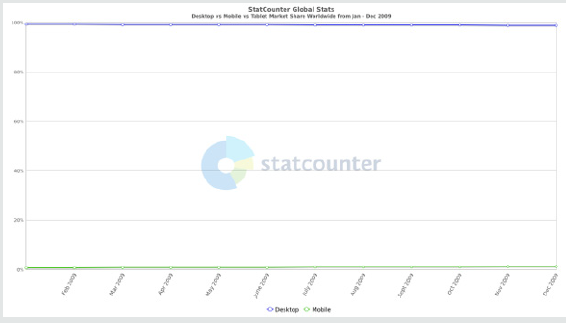
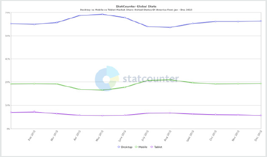
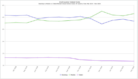
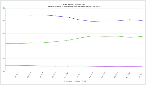
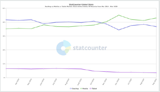
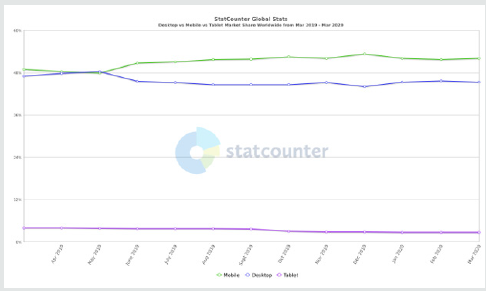
The mobile-first approach is about starting the design from a mobile reference resolution and progressively enhancing it using media queries to adapt to other contexts. The older approach was defaulting to a desktop layout and then gracefully degrade to smaller devices since content must be filtered to match the real estate [5]. The following research data from Figures 1-6 show a steady increase in mobile consumers over the past decade, not only in the US but also worldwide [6]. A decade ago, the number of mobile users was very few; five years ago, it increased by many folds, and this year, mobile adoption has surpassed desktop utilization and is still growing steadily
As evidence suggests, it is extremely important to have a mobile site or an app first, which is the problem statement being addressed by this research. The mobile-first approach should be incorporated into requirements and UI design for all future implementations; it should be the default, and other device support emerge from there, enhancing progressively.
Design considerations
Designing mobile websites is different from desktops not only in terms of visuals, but also in terms of screen size, lack of pointing devices, restricted download and upload speeds, difference in user goals, etc. However, mobile sites should not be limited in scope and should include all the information of the full site. Regardless of the device, a responsive site should be simple, understandable and relevant [7-10].
1. Simple-Users should not require considerable time to understand how to use the application.
2. Understandable-Workings of the application should be made obvious by minimizing controls, usage of understandable iconography, usage of standard controls is a considerable benefit, technology-specific icons should be avoided. For ex: the iOS share icon looks like the ’expand to full screen’ icon.
3. Relevant-Most vital information should go at the top of the screen getting progressively general as we navigate down the page.
4. Small screen: Elements in the UI that are not necessary should not be included in the mobile site because a crowded UI makes the app confusing, unattractive and this is amplified on smartphones when the size is 25% of a desktop screen size.
5. Less memory: Desktops have 4 GB to 32 GB RAM, whereas mobile device RAM ranges from 256 MB to 2 GB at most. Mobile application should be optimized to run on very low memory.
6. One window, one app: Mobile users may only be able to see one browser window at a time. Multiple windows, tabs and pop-ups should be avoided.
7. Minimal Documentation: Users might not read instructions or help documents before using the app; hence, the app has to be simple and use standard widgets.
8. Development considerations: UI should provide the right category and make it easy to perform common tasks. If a feature is not core to the user, it should not be included on the application landing page. Mobile device real estate provides no room for functionality that does not focus on the primary task.
Targeting mobile web kit
Features such as mobile web kit can be used to create web applications that look like native mobile applications [7,11]. The following are some of the components and design considerations while working on mobile web kit.
1. Status bar: The mobile status bar (showing signal strength, battery, etc.) should not be hidden by the application. Having to close the app to view the battery status does not result in a good user experience.
2. Navigation bar: Alter the controls or workings of this only if it is absolutely necessary; most of the time, this should be unedited.
3. Home screen icons: These are the shortcuts to bookmarked applications.
4. Start-up image: This is the image displayed while waiting for the site to download when clicked on the home screen icon. This can be suppressed to achieve better battery performance.
Additional design guidelines
1. Minimize keyboard entry: As per reference [7] minimize keyboard entry and Create a list or picker wherever possible. Wherever data entry is inevitable, make it as simple as possible, remember user information (except for sensitive information such as password, SSN, etc.) that has already been entered.
2. Be succinct: Make the application content obvious, minimize mandatory input, minimize text.
3. Hidden fields and menus: Avoid popups, navigation bars, and hidden fields should only be visible only when hovered over. Drop-down menus with submenus that pop out on hover are bad for desktops and even worse for mobile devices. Users do not hover on touch devices, they touch. Move away from a drawn-down pull-out menu pattern in favor of click-based menus instead.
Performance considerations
The performance of a mobile site is important. However, sophisticated sites might be of less use if they cannot be rendered on the user’s device quickly. The following are a few of the factors affecting mobile performance.
Battery life: CPU usage drains the battery. Some of the factors to be considered to ensure that the apps do not greedily occupy CPU cycles are as follows [12,13]:
1. Defensive coding expects that the mobile device is not
plugged-in for charging.
2. Avoiding reflows.
3. Minifying both the size and activity of JS.
4. Minimizing AJAX (asynchronous JavaScript) network
request calls.
5. Using CSS wherever possible.
6. Avoiding serving WebGL to mobile devices.
Here are some of the specific design choices that draw less power and thereby increase battery life [7, 11].
1. Using dark colors: Colors, media elements such as background images, foreground images, video, audio, and animations all contribute to battery drainage. Lighter colors consume more power to display than darker shades.
2. Using JPEG: Using JPEGs instead of PNGs or GIFs. JPEGs compresses images better and are faster to render and hence energy efficient.
3. Reducing JS size: Minify both the size and activity of JS. Every time a JS needs to be processed, the browser ceases downloading additional assets until the JS file is fully downloaded, parsed and executed. JS is the most energyconsuming webpage component.
4. Eliminating network requests: Polling makes a radio connection to the nearest cell site, thus draining the battery. If polling is not required at regular intervals, to conserve battery life, messages and the number and frequency of network requests after page load should be limited.
Latency: The speed at which a website including the markup, style sheets, media, application and 3rd party scripts run on the devices is affected as much by latency as by the bandwidth [7]. The distance between the mobile device and the closest cell tower is the main cause of latency. To optimize mobile sites against latency, reduce the number of HTTP, AJAX and DNS calls.
1. Reduce the number of HTTP requests: Methods for reducing HTTP requests are browser cache, combined JS file, single style sheet, image sprites, image compression. Use font instead of image icons (for ex; create a custom icon font from http://icomoon.io), inspect and optimize site usage tips from Yahoo (https://developer.yahoo.com/yslow/) or Google’s (https://developer.google.com/speed/pagespeed/) or similar sites.>
2. Reduce the size of requests: Minify text-based assets such as CSS, JS, and JSON using minifying assets (for ex: yui compressor for CSS and JS). Compress binary files and GZIP everything-once files are compressed GZIP ping them accelerates download speed, reduces image size and sends only the right size images using media queries. Minimize cookies and defer/avoid 3rd party scripts.
3. Performance antipattern: The following design strategy might not go well with the best practices, but it certainly reduces latency, and hence, needs to be used with caution;
• Embedding CSS and JS for the first page load.
• Extracting the above files in local Storage. ‘local Storage’ for web or mobile apps is a method for accessing storage in the browser.
• Setting cookies with the names of the extracted embedded files.
• On subsequent requests, checking the cookies server side.
• Only embedding new and missing scripts.
• Loading files from local Storage.
4. Memory: The mobile browser will generally close or crash to free memory, and we need to manage the memory requirements of the application to ensure they do not use too much memory and slow or crash the browser. Use Chrome Developer Tools Timeline Panel to manage memory usage.
5. Optimize images: Some of the tools for image optimization are Image Alpha (http://pngmini.com) and Imageoptim (http://imageoptim.com). Reference [14] suggests resizing images to match the display size; the Sencha.io (http:// www.sencha.com/learn/how-to-use-src-sencha-io/) proxy determines what size image the user’s device requires and will shrink (not grow) images before sending. Use GPU memory for images rather than CPU memory
Mobile Native Apps vs Responsive Web Applications
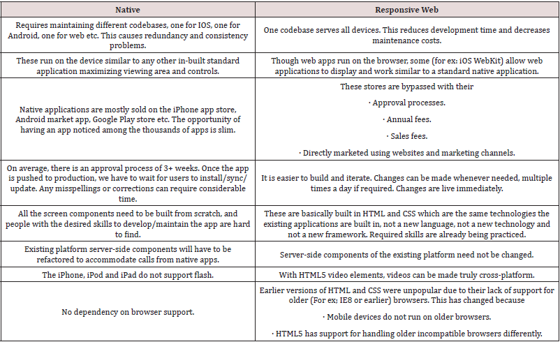
Table 1 presents a comparative analysis of native mobile apps and a web application [1,2,7,15]. Native apps are applications that are downloaded on the device and operate similar to a standalone program. Internally, they make network calls and work on data. Hybrid apps are a combination of native and web apps that provide platform-specific functionalities such as native apps and network interactions such as web applications. Hybrid apps are not considered for this comparison because they are an assortment of both approaches. If the UX architecture is planned well, hybrid apps have the advantages of both native and web applications [15].
Becoming Responsive
It is possible to transform any existing HTML or other server-side frameworks, such as Spring, JSF, and strut-based UI, to be responsive. For the purpose of this research, an existing non-responsive application was considered and re-engineered successfully. It was built on a spring framework with HTML, CSS, JSP, and composite view design patterns to optimize fragmentation and reuse. This was a common pattern a decade ago, and this will also be the hardest pattern to retrofit. An expectation here is that such a project frequently faces this predicament of ’refactor’ vs ’build from the ground up’. Sections and tables in the images below are specific to the application researched. These are only indicative, similar applications will still work while analyzing any kind of composite view fragmentation. These can be used as a sample tabulation for research. Transformation is carried out in 2 phases:
1. An optional refactoring phase - a set of activities that can be carried out by a single team in isolation for most parts. This is applicable only to refactoring applications.
2. Design and development phase - Designing or redesigning involves working with all (product, design and UX, etc.) the teams; here we also build capabilities for future responsive designs such as having a standard set of breakpoints across applications etc.
Phase 1 – Refactoring
In this phase, the existing implementation is refactored into a responsive site. Of course, building new solves problems, but there are many unique scenarios that are solved better by refactoring.
Migrate to HTML5: The following are the steps involved in migrating to HTML5 (currently recommended baseline) if not already done. These are fundamental steps only for migration and do not include implementation of special features of HTML5 unavailable in the current version.
a. Counter intuitive: HTML5 migration only facilitates the usage of RWD and CSS3 and is not for streamlining and improving the code quality of the existing implementation. HTML5 does provide better implementation of most existing designs but that is not the intent here.
b. Changing the doc type: The first step is to add the document type in HTML, as shown in line 1 below.
[language=HTML]
c. Adding a ’viewport’: This is a metatag as shown in line 2 below, which is normally added to the head of an HTML page. It controls the page’s dimensions and scaling.
[language=HTML]
< meta name=”viewport” content=”width=device-width, initialscale= 1”>
d. Identify obsolete elements: For implementations still in HTML4, obsolete elements disused in HTML5 are here: https:// www.w3.org/TR/html5-diff/; these needs to be replaced.
e. Obsolete element replacement strategy: Establish a replacement strategy for obsolete elements. Refertohttps://rawgit. com/whatwg/html-ifferences/master/Overview.html#obsoleteelements for the replacement strategy.
f. Amend HTML5 changes: Amend HTML5 changes in CSS and other relevant files, this also helps in making grids flexible. Usage of boilerplate and normalize.css is allowed if needed.
Amend RWD Changes: Amend the following RWD changes in all the HTML and CSS code:
Enforce CSS styling: To apply responsive web design changes, it is important that the styling information comes from the CSS files and is not incorporated inside the HTML. If styling information is directly embedded, such files should be refactored to move styling changes to the CSS files. The following is an inline code that needs refactoring;
< div class=”some Example Class” style=”width:120px;”>
Analysis and editing: Chrome inspection features (or any similar features, such as Firefox) can be used to view, analyze and edit the HTML rendered on the client browser. Changes can be made online, and its output can be observed as in any other WYSIWYG (what your see is what you get) tool. This is achieved by opening Chrome and CTRL+SHIFT+”I” opens up the ‘inspect’; click on the magnifying lens icon and click on any element; its details are displayed at the bottom half of the screen. These files can be edited and stored in a separate location; editing the version of the file that is actually rendering the visual can only be done in a WYSIWYG (Dreamweaver) tool as described below. Configure live view Dreamweaver to the exploded (normal folder and not archive format) format first because live view edit does not support hot deployment. Dreamweaver needs to be configured for remote server deployment to take advantage of this feature.
A flexible, grid-based layout: All the pixelated measurements should be converted to relative percentage measurements using the formula ‘target % Context = Result’. The following approaches can be adopted in analyzing the existing implementation and amending them to be flexible. This formula can be used for all (layout, grid, margin, padding) purposes. Usage of HTML and CSS frameworks such as Bootstrap, CSS Flexible Box Layout, also known as Flexbox can serve well here for redesigning grids [11, 16-19].
Tile analysis - Usage of Spring, JSF, Struts, etc. frameworks enforces composite view pattern fragmenting the page into layouts and tiles. Commonly reusable elements such as header and footer are grouped into respective layouts or tiles. Amending these are not as simple as amending HTML, and hence, additional steps need to be followed to migrate them. Table 2 shows all the layouts, number of tiles making up those layouts and number of pages (multiple JSPs are combined to form a page) implementing them. This is specific to the application being researched.
Table 2: Composite view implementation in server-side frameworks can have many such layouts and tiles.
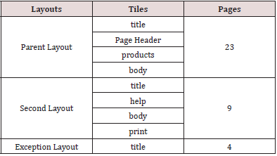
These layouts are not very different from one another. Analysis done on ‘parent Layout’ will be mostly applicable to the other layouts as well.
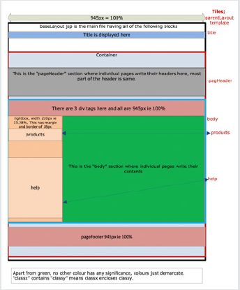
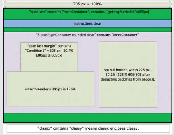
Block analysis(div)- Blocks shown in the above diagram are not the complete list; they are only the main blocks. There are many small blocks that cannot be shown here. The diagram indicates the approach and process to be adopted while migrating from fixed elements to fluid responsive elements, which should be used as a guide and not a blueprint. A similar analysis should be carried out on other layouts and pages while incorporating the changes to the whole application. Figure 7 shows the composition of the header and the body section. Pages differ mostly in the body section; other tiles (except the title and sometimes the header) are constant and do not change with the page. Figure 8 shows the composition of a typical body section and how to amend its responsive components.
Flexible lmages and media: This is quite similar to the components before i.e., layout or grid enclosing the media needs to be made fluid first, and then the image using max-width = 100%. If a media or an image does not have an enclosing grid, it needs to be created first. If a 175x35 image is in a 350 px layout, first enclose it in a fluid block of 50% width, i.e., 0.5 175% 350 [20,21].
Media queries: A media query is a module from the CSS3 specification that adds flexibility by providing means to handle display features for each display setting (size and layout) separately [2,7,11]. Flexible layout and flexible media should be implemented and fine-tuned after reviewing inputs from the ‘mobile-first approach’ and ‘resolution breakpoints’ analysis in phase 2 because the implementation of media queries will be greatly influenced by this. Since fonts are inflexible, we have to use media queries while sizing them in phase-1.
• Font size: By default, this research uses 100% font size, which is suitable for viewing in 1024 px display (this is an existing site, and hence, is not a mobile-first design). Font sizes should be adjusted appropriately (for example, a 768 px display might use font size of only 90%) to the display size using a media query.
Event listeners: All existing even listeners specific to select, click, etc. need to be modified to be more generic. They need to handle touch events as well. Hover- and other computer-specific events are not available for mobile devices.
Phase 2 - design and development phase
To add device-specific responsiveness, requirements and UX need to be redone using the ’mobile-first design’ and ’resolution breakpoints’ as described in the later sections. This entails designing bespoke user interfaces for every breakpoint. This might sound like a lot but it is most crucial. In this example application scenario, the UI is gradually degraded to lower resolution displays since it is an existing web application.
Amend RWD changes: Amend the RWD changes from previous sections in all the HTML, JSPs and CSSs. Follow the previous sections while ignoring all the sections that discuss refactoring an existing implementation and completing the changes. All the concepts from phase 1 hold here too.
HTML and CSS Frameworks: It is preferable to use an HTML/ CSS boilerplate framework such as Bootstrap and Flexbox instead of attempting to build grids manually. There are many such alternatives. Flexbox offers many advanced and sophisticated features that can make even an old site look reasonably fancy [11,16-19]. It can seamlessly handle dynamic settings such as box alignment, ordering, direction of flow, space between them, growth and shrinking, wrapping, and left or right justification with minimal coding; a sample Flexbox code looks something like this:
.container {justify-content: flexstart | flex-end | center | space-between | space-around | space-evenly | start | end | left | right ... + safe |unsafe;}
Resolution breakpoints: Breakpoints make RWD relatively future proof in that it can support new breakpoints needed at any time [5,22]. If a new 5-inch device or 15-inch device takes off in the market, the code can support the new devices without having to redesign UX. RWD does not tie design to a particular device. Designers should identify all the different screen and layout resolution breakpoints that will be supported, and a detailed UI design should be provided for all of them. These are the widths, depths, images, font, etc. that the design needs to be detailed. It does not mean that the widths below or above the spectrum will not be accommodated, but building a list like this helps standardize a scope for the efforts, allowing identification of devices most commonly used, and how best to test against their respective resolution. There should be a default handling mechanism for screen resolutions beyond this spectrum. Table 3 is a small suggestive list of resolution breakpoints.
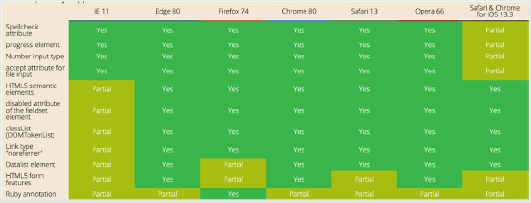
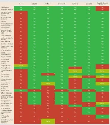
Browser support: It is difficult to establish exact browser support for HTML5 and CSS3 because all of the major browsers support them; hence, feature-specific browser support needs to be analyzed. Reference [23] provides more exhaustive study on this as shown in Figures 9 & 10.
Overhauling
If the existing user interface is replaced with a new UI while keeping the server-side component such as a restful API as it is, then the following needs to be addressed before embarking on this plan;
1. Reusability-Identify reusable components and have a game plan.
2. Estimation or Sprint Plan-Reusability needs to be factored while planning sprint planning or estimation.
3. Awareness-Document, share and spread awareness about reusable components (for ex: if address validation is reused, this needs to be documented and all the engineers need to be aware of its existence and usage).
4. Review-There needs to be a stringent review process to ensure reusable components are efficiently reused to avoid reimplementing algorithms already coded.
5. All click event operations need to be refactored to accommodate ’touch’ events.
6. Heavy refactoring of JavaScript and CSS merges these files to reduce server round-trips.
7. Clarity of images - Remove unclear, uneditable, obscure and very large images that do not add significant value to the content.
8. If a large un editable image needs to be used, use it in the background or in line with the text.
9. Use the ’image plus text element’ pattern where every cell is a combination of an image and a text related to it.
Web-services invocation or any server-side component is an easy and obvious reuse candidate. It also depends on how it has been invoked. If it is a JSON-based interaction, then there will not be any migration needed. However, if it is a server-side frameworkbased integration such as Spring MVC, it might have to be refactored too, just for the contract.
Testing
All the pages in the application should be thoroughly tested. Simulators can be used temporarily for simulating different resolution breakpoints. Ideally, it is best to run the tests on actual devices, but it might not be possible to do so because there are thousands of devices. It is therefore suggested that the tests be performed on a representative group of actual devices, covering different configurations, browsers, operating systems, device capabilities, etc., in addition to tests on actual devices with Wi- Fi turned off and with many uncontrolled apps running in the background. Table 4 shows some of the most widely used emulators and simulators.
Emulators and simulators
An emulator is software that duplicates or emulates the function of a mobile device on a computer, so the emulated device closely resembles the behavior on an actual device. In the simulation, an abstract model of the mobile OS is simulated. In addition to testing on emulators and simulators, testing on an array of different mobile devices is still recommended. The following table shows where emulators/simulators for different mobile OSs can be obtained:
Online tools
To access the device’s vital statics that impact basic media queries, use http://www.quirksmode.org/m/tests/widthtest.html. The W3C mobile checker (http://validator.w3.org/mobile/ and http://mobiready.com) checks the website for best practices and provides information on links to help make the website more responsive.
Discussion
First, it Is exciting that the research was successful in transforming an old application into a responsive application. At the same time, the effort estimates and the skill level of the developer to work on such tasks is considerable. Unlike normal greenfield builds, this might be a task suitable only for experienced professionals. For poor designs, the effort estimate for refactoring is not very different from the estimates for a rebuild. However, it is subjective, and this effort is higher in situations where basic design protocols such as separating HTML and CSS are ignored and have all styling in the tags. This would involve restructuring first and bringing it on par with code and design best practices. This is one of the main driving factors for tearing down and rebuilding from the ground up. However, there are many situations where it is not always possible to do so. What if the existing codebase cannot be torn down and rebuilt? What if some algorithms cannot be refactored for various reasons? What if there are many third-party integrations, and hence, a site is very fragile; under such circumstances refactoring is the best alternative. The UX community has been advocating rebuilding in most scenarios, and even Google search for refactoring does not yield many results. That does not mean that rebuilding is the only option. There is also an element of surprise in this work. While working on the research application, it was also observed that the changes made to one of the ’body’ tiles could be replicated over and over again for many tiles with minor changes in the text. This can greatly reduce the effort estimate. It is very likely that other implementations would also find this kind of surprise since there will be many similar-looking pages. If an application has many pages, the designers would have maintained the same feel across the application and across the organization to enhance familiarity and readability. The call to refactor vs rebuild need not be done in one attempt. Different teams can work on different parts, reconvene after making some progress and evaluate where they stand. Teams should be open to reconsidering their decision and changing course if needed. This agility is most important in implementing this approach and implementing it on time. With infinite time, both approaches are equally feasible.
Conclusion
For any business going online, mobile apps or mobile sites are currently a mandate. Many studies have shown that mobile usage is skyrocketing and will continue to do so. For organizations already running sites in production, they either need to refactor their sites to be responsive or rebuild them based on their architecture. It is possible to convert an existing rigid site into a responsive site, and this research offers all the details for the same. This research also offers specific design guidelines for building RWD as a design and as a continuous practice. There are, however, different flavors for providing responsive design, such as native apps, responsive design or hybrid apps.
References
- Fedosov A, Ojala J, Niforatos E, Olsson T, Langheinrich M (2016) Mobile first? in Proceedings of the 20th international academic mind trek conference on-Academic Mind trek ’16 pp. 198-207.
- Marcotte E (2010) Responsive web design no. 306 p. 1-22.
- Koen PA, Bertels HMJ, Kleinschmidt E (2014) Managing the front end of innovation-part I: Results from a three-year study. Research Technology Management 57(2): 34-43.
- Koen PA, Bertels HMJ, Kleinschmidt EJ (2014) Managing the front end of innovation-part II: Results from a three-year study. Research Technology Management 57(3): 25-35.
- Giurgiu L, Gligorea I (2017) Responsive Web Design Techniques. International conference KNOWLEDGE-BASED ORGANIZATION 23(3): 37-42.
- StatCounter (2020) Desktop vs Mobile vs Tablet Market Share Worldwide.
- Weyl E (2014) Mobile HTML5: Using the Latest Today. O’Reilly Media; (1st edn.), (December 2, 2013) pp. 435.
- Jehl S (2014) Responsible Responsive Design. A Book Apart.
- Estelle Weyl AG, Louis Lazaris (2011) HTML5 & CSS3 For The Real World: Estelle Weyl, Louis Lazaris, Alexis Goldstein pp. 400.
- Authors V (2011) A List Apart. Choice Reviews Onlin 48(8): 48-4221.
- Frain B (2015) Responsive Web Design with HTML5 and CSS3. PACKT.
- Thiagarajan N, Aggarwal G, Nicoara A, Boneh D, Singh JP (2012) Who killed my battery: Analyzing mobile browser energy consumption.
- Camps F, Fanchon J (2010) Web browser energy consumption. In 2010 8th international conference on communications pp. 397-400.
- Schade A (2017) Big Pictures on Small Screens: Remove, Resize or Reorganize.
- Lee S, Dolby J, Ryu S (2016) HybriDroid: static analysis framework for Android hybrid applications. In Proceedings of the 31st IEEE/ACM international conference on automated software engineering-ASE 2016 pp. 250-261.
- Ng H (2016) CSS Flexbox Module.
- Tricks CSS (2015) A complete guide to flexbox.
- Marcotte E (2015) Putting My Patterns through Their Paces.
- Marcotte E (2015) Responsive design: patterns & principles.
- Staff CB (2016) 50 fantastic tools for responsive web design.
- Marcotte E (2009) Fluid Grids.
- Schade A (2014) Responsive Web Design (RWD) and User Experience.
- Daveria A, Schoors L (2014) Caniuse.com.

Top Editors
-

Mark E Smith
Bio chemistry
University of Texas Medical Branch, USA -

Lawrence A Presley
Department of Criminal Justice
Liberty University, USA -

Thomas W Miller
Department of Psychiatry
University of Kentucky, USA -

Gjumrakch Aliev
Department of Medicine
Gally International Biomedical Research & Consulting LLC, USA -

Christopher Bryant
Department of Urbanisation and Agricultural
Montreal university, USA -

Robert William Frare
Oral & Maxillofacial Pathology
New York University, USA -

Rudolph Modesto Navari
Gastroenterology and Hepatology
University of Alabama, UK -

Andrew Hague
Department of Medicine
Universities of Bradford, UK -

George Gregory Buttigieg
Maltese College of Obstetrics and Gynaecology, Europe -

Chen-Hsiung Yeh
Oncology
Circulogene Theranostics, England -
.png)
Emilio Bucio-Carrillo
Radiation Chemistry
National University of Mexico, USA -
.jpg)
Casey J Grenier
Analytical Chemistry
Wentworth Institute of Technology, USA -
Hany Atalah
Minimally Invasive Surgery
Mercer University school of Medicine, USA -

Abu-Hussein Muhamad
Pediatric Dentistry
University of Athens , Greece

The annual scholar awards from Lupine Publishers honor a selected number Read More...


